Expenditure Calculator for Studies
Time is often a limited and valuable resource for students. The application "Expenditure Calculator for Studies" is designed to help you to analyse the time spent on a course of study or on individual courses more precisely. It should therefore be possible to manage the following information:
- Time expenditure for individual courses:
- Attendance of the course
- Homework
- Test preparation
- Cost-benefit calculation for a course: effort vs. personal learning success vs. ECTS vs. grade
- Aggregation of the individual information (expenditure per semester, year, total duration of study)
In this project, special attention should be paid to the visualization of the collected data.
Principles and methods
This section explains the technologies and tools used.
Sketch
Sketch is a paid design tool that is used to create prototypes. The tool allows the developer too quickly and easily design user interfaces by first defining individual components and then inserting them into an artboard by dragging and dropping.
Artboards represent individual sections of an app or website, such as the login screen or the settings page. In practice, a separate artboard is used for each view of an app.
Artboards can also be connected to each other. This is done if you want to show that a new view appears when you click on a certain control element, for example a button. These connections are marked with orange vectors.
Sketch is only available for MacOS and it allows the installation of various third-party plug-ins. One of these plug-ins is Material by Google LLC. This plugin provides a large number of pre-made control elements that follow the Material Design Guidelines (more on this in the next section). Just to say that this plug-in saves the developer from creating his own components and if you are developing an Android application anyway, you already have all the components here that look exactly like they will later be in the app. So you can get an idea of the approximate final result in advance.
Material design
Material Design is a design language developed by Google. On the official website the following definition is given:
Material Design is a design system – backed by open-source code – that helps teams build high-quality digital experiences for Android, iOS, and the web. It is inspired by the physical world and its textures, including how they reflect light and cast shadows. Material interfaces are made of digital "paper-like" surfaces that change shape and move in three dimensions, with text applied as "ink" that ripples when touched or pressed.
The design is based on material-like surfaces and the design style Flat Design, which is known for its minimalism, but still uses a lot of animation and shadows to represent objects as "materials" with a behavior according to the laws of physics (e.g. a slight depth effect) and to let the user immediately recognize which areas contain important information or are interactive and what this interaction will cause. This video is highly recommended on this topic.
To ensure that material design is used correctly in your application, there are the so-called Material Design Guidelines. On the official website mentioned before, these guidelines are described in detail, especially in the tabs "Design" and "Components". These guidelines describe what you should and shouldn't do in order to provide the best possible user experience. They also explain in detail what each component does, which dimensions and spacing it has, the used font size and so on.
Material design is nowadays used in many apps (primarily on Google's Android operating system) and less frequently on the web. Google continuously updates its web services with material design and offers APIs for other developers to implement the design guidelines.
Although the components are provided by a library in Android, attention is paid to where and how these components are used. This keeps the learning curve for users very flat, as they can more easily recognize similarities from other applications and predict the respective behavior before actually using them.
Implementation and results
From the beginning it was clear that this project would be realized as an app. This is for the simple reason that the students are the focus group, almost everyone of whom has a smartphone, and this gives you the greatest possible reach.
A web application would also have been an option but opening the browser, eventual re-login and loading times would only lead to a deterioration of the user experience. However, there would be the advantage that you could use the web application on your computer.
Prototype
The prototype was developed with the before mentioned design tool Sketch.
The planning was not particularly exciting, since I had already some practical experience designing user interfaces and with the design tool Sketch.
The concept of the application was already more or less given in the task definition and after that it was only a matter of realizing this in Sketch. Which components are suitable for this project was pretty much clear beforehand, since I had already dealt with the Material Design Guidelines and Apps several times.
Unfortunately the Sketch file, which contains the prototype, was overwritten while the documentation was being written. Therefore the overall picture of the prototype, with the orange connection vectors, can no longer be shown here in the documentation.
Fortunately, before that, the individual artboards were exported as image files. The following pictures are up to date and were also used in the evaluation.
Home view
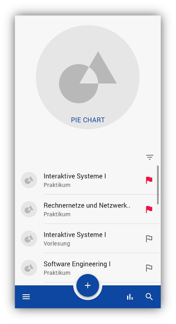
The Home View is the first thing the user will see after opening the application. At the top is a pie chart that shows the user the previous effort in hours per course.

Right below is a list that can be scrolled and contains individual list items. The individual list elements each represent a course and contain a picture and a flag in addition to the course name and type. The flag makes it possible to mark certain courses as important and these are then displayed at the top of the list. You can also sort the list using the Filter button.
At the bottom of the screen there is a BottomAppBar. A BottomNavigation was also an option, but according to the guidelines, the Bottom App Bar can also include a Floating Action Button (FAB) , which gives more space for the main content of the app. Otherwise, the FAB would have to be placed above the Bottom App Bar, which, as I said, takes up more space.
A Top App Bar6 would also have been an option, but this has the disadvantage of being located at the top of the screen. Users with larger smartphones would then have to use both hands to operate it, which in turn is conveniently possible with the Bottom App Bar with one hand.
Besides the FAB there are also 3 icons that serve as navigation elements. On the far left is a menu that opens a Bottom Drawer. With the second icon from the right you can access the statistics and with the search icon you can search the list for a specific course.
With the FAB you get to the Course Editor View.
Course Editor View
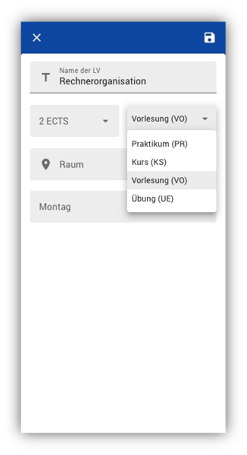
This app view in the prototype is kept quite simple and allows the user to create new courses.

The individual fields are text input fields or drop-down menus, as you can see in the picture.
The following information can be entered:
- Name of the course
- Number of ECTS
- Type of the LV
- Room in which the LV takes place
- Weekday on which the LV takes place
The input fields should also light up red if no valid input was made.
In the upper right corner you can finally save your course and add it to the list in the Home View.
Course Details View
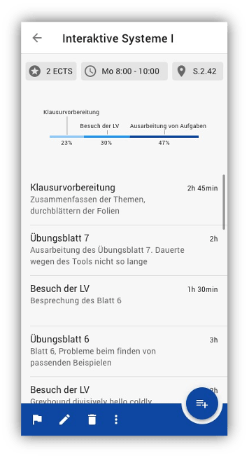
In the Course Details View details of the respective course should be displayed.

At the top there is a top app bar, which contains the name of the course and a back button to navigate back. The Top App Bar is necessary because according to the material design guidelines the Back Button must not be positioned in the Bottom App Bar.
Underneath it there is a chip group with individual chips containing information of the course, which was entered when creating the course.
Below the chip group there is a horizontal bar chart, which shows the distribution of the individual efforts in the course. The possible effort categories are given in the task definition.
Next there is again a list which contains the individual efforts, which were added by the user. This list shows only the effort of the respective course and is sorted by the most recent entry, which always appears at the top instead of at the bottom. The entries in the list include the category of effort, a short description of what was done, and the time spent on it.
At the bottom of the list is again a Bottom App Bar with the following options (from left to right):
- Marking the course (flag icon)
- Edit course: Allows you to edit the course information (name, weekday, ECTS, ...). Clicking on the editing icon opens the Course Editor View, which is also used to create a course. However, the fields will be filled in with existing information so that they can be edited.
- Delete a course (irrevocably). Before doing so a dialog will open for confirmation
- Possibly further (not yet defined) options
On the far right there is also another FAB with which you can create an effort entry. A new window is opened, similar to the Course Editor View. The FAB has been positioned on the right side of the Course Details View to offer a better distinction to the Home View.
When designing the prototype, care was taken to keep the hierarchy flat (you shouldn't have more than 4 levels so that the user can keep the overview). In addition, care was taken to ensure that the most important elements stand out and that the material design guidelines were followed.
Evaluation of the Prototype
Just because the developer likes the prototype, it does not mean that it is useful in practice or that it will be well received by the user. Therefore the prototype had to be tested to avoid surprises later and to save development costs.
In order to get the best out of the task, four different students (the apps focus group) from three fields of study and two universities were interviewed (Alpen Adria University Klagenfurt and WU Vienna). Thus a large range of requirements could be covered.
The testing was carried out as follows (using the Think-Aloud method)
- The test persons were put into a scenario in which they wanted to measure the actual effort of their studies. For this purpose they installed this app.
- The sketch prototype was printed out on a sheet of paper that the test subjects can interact with
- The test persons were asked to say everything that comes to their mind out loud
- Now and then the developer has given tasks
- The conversation was recorded, which allowed one to fully concentrate on the respective test person.
- the pie chart should be in the Statistics View (with the remaining statistics)
- the statistics symbol, which represents bars, was not correctly interpreted by almost all test persons
- the FAB did not stand out particularly, although it should be one of the most important elements
- the flag function was described as cumbersome. After several semesters you could not keep the overview in the list
- the LV picture in the list is useless
- the memory symbol in the course editor was not interpreted as such
- adding the time to a course is desirable
- in the course editor, either all fields should have an icon or none at all
- the menu item with the three vertical dots should be removed in the course editor, if there is no functionality behind it
- color of the app questionable - test person was not sure if this matches the image of the app
Android application
After the evaluation, the prototype was implemented as an Android application over several weeks. There are dozens of hours of work behind it, as special attention was paid to the small details and quality of the implementation. The shortcomings that were found during the evaluation were directly included in the creation. There was no reworking of the prototype, although in practice it would have been certainly a good idea.
Java was chosen as the programming language instead of Kotlin, which is gaining more and more popularity.
The final result of the application can be viewed in the following gallery.